

Today I want to share some ideas and tips how you can make your crochet jewelry photos more attractive and appealing by using inexpensive props and creating a story behind it.

I mostly make romantic, vintage-inspired jewelry which greatly influences the background for my pictures. Thus, I follow the feel it dictates and work around it.
Props I use
1) Cards, letters, envelopes, tags, print, music sheets
During the years I have collected an amazing number of cards, letters, tags and prints I love adding to tune in with the jewelry in question. There are lot of free printables on instagram. For instance, my vintage ladies cards, some sheet music and the vintage letters are from there.
2) Dried, fresh, artificial, fabric or paper flowers
Flowers of any kind do beautify and make a photo richer. As I am crazy about flowers, I do tend to include them constantly in my photos.
3) Candles, tea lights, cute perfume bottles, colored glass cups or vases are also interesting props to be added.

4) Laces, ribbons, doilies, buttons and beads add a lovely charm to the overall effect.
5) "Organic props" as I like to call them, include pine/fur cones, chestnuts, pebbles and stones, feathers and shells.
5) "Organic props" as I like to call them, include pine/fur cones, chestnuts, pebbles and stones, feathers and shells.


6) Other pieces of jewelry, wooden (or other ) jewelry boxes, jewelry dishes and holders.
7) Books and magazines.


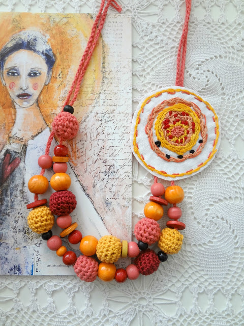
The background I almost exclusively work on is white and it is this heirloom crochet tablecloth I've inherited from my grandmother. It has become a kind of insignia for my work. Styling photos in a certain way tends to become your signature you will be recognized by.
When styling a still photo, I suggest you gather materials / props that you think would match and emphasize the jewelry more, but not steal the focus for the jewelry piece in question.
Work around with different props, pile them up, scatter them around until you are satisfied with the look.
For example, these are the props I used for the intro photo of this post: since this necklace is gentle and romantic, I chose to include a vintage letter, added a dried rose as a continuation of the story of the rose necklace. In that same line I added the metal caps and pearl beads - because they are also part of the necklace. To add more texture and spread more of the general color of the necklace (red/burgundy) I added the dried flowers bouquet over the vintage flower cardboard. And lastly, the lovely vintage card of a lady I love using over and over again.

I hope you find these tips interesting and inspiring. I would love to read your ideas about styling still photos. What props do you use?
8 comments:
Most helpful and inspiring! I do have the odd props scattered around the house, so I have to gather them before starting making pictures. I try a signature background too (at least for my stitch markers), which is a tartan cloth. You pictures are always so beautiful! Real works of art!
Thank you so much for this post! It is very helpful for me as well. My signature background is usually my wooden floor for lay-flat pictures, but I am at a loss when it comes to props and arranging items. I will try to follow your advice from now on, your grandma's crochet tablecloth has been a favourite of mine for a long time. :-)
You gave me a lot to think about here, Maya. I don't think that I have a signature look, at least not international, sometimes I feel more rustic, sometimes more vintage, and I don't tend to add a lot of accessories to the photos. I have a ton of stuff I could use, I'll give some thought to using it more. I must add that your photos are always beautiful and I always think that you present your makes in the best possible way.
Amalia
xo
I love the way you style your pieces and so its great to learn about your process. I rarely style my pieces (though I would really like too) as I find that my clients look for product shots over styled shots.
Thank you Marjan. I think your tartan piece is great as a background for your markers!
Thank you Alhana! The wooden floor (dark or light, brown, black and white) is used by a couple of bloggers I follow, and it is also great as a background.
Thank you Amalia! I agree with you on the feel. I too love mixing styles, for example during the summer months I tend to make more of my bohemian jewelry which requires different styling and background.So I change the styling accordingly. Having fun in the pcoess is also important :)
Thank you Divya! Your product photos always look great with the focus on the jewerly. Especially that dark grey(?) slate you use.
Post a Comment